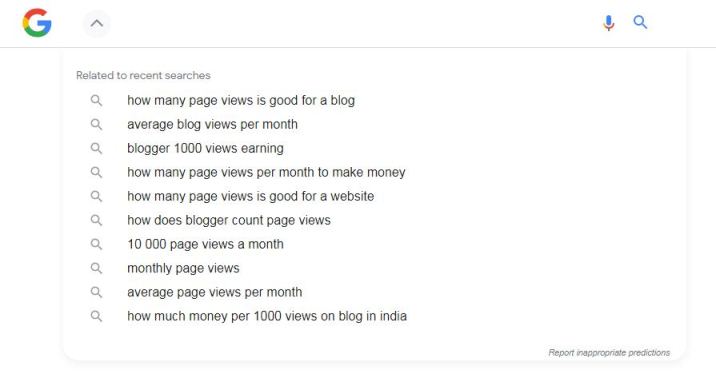
This post is for a quick update about Google search bar UI and search suggestion change. New Google search bar UI looks nice compared to the previous one.
Let’s check out the changes,
1. Related to recent searches in place of Search history
Previously when you search anything in Google search bar and remove your search query from search bar, then Google shows you your previous searches drop down list.
But,
Now, when you clear your search query from Google search bar, then Google shows you “Related to recent searches” drop down and related “Trending searches” if available.
These searches are nothing else but search suggestions which are available at the bottom of the search result page.
2. Search bar text input UI change
In Google search bar input change, input box border is removed, you will get an empty area where you can click and type your search query.
Now, the search bar area looks more spacious and clean.

3. Dismiss suggestion box arrow
New Google search bar UI gives up an arrow icon button to dismiss or close the suggestion box which is automatically shown based on your search input.
Previously, this suggestion box did not have any dismiss option and was closed automatically when the user clicked outside the search bar.
4. Google home logo view
In the new Google search bar UI, when the suggestion box displayed, the Google home logo changed from “Google” to “G” logo.
That’s it for now,
Hope, you also like this new Google search bar UI update.